Evolve Cooltures
Corporate Program Branding
Evolve Cooltures is a transformative leadership & team development program rooted in neuroscience. I was brought on to develop its full brand identity, from creative strategy to visual language & art direction.
-
Story, Vision, Mission, Values, Target Audience, User Journey, Competitive Analysis, Brand Tone & More
-
Research Based Moodboard (Color Palette, Photography Style, Typography Inspiration, More)
-
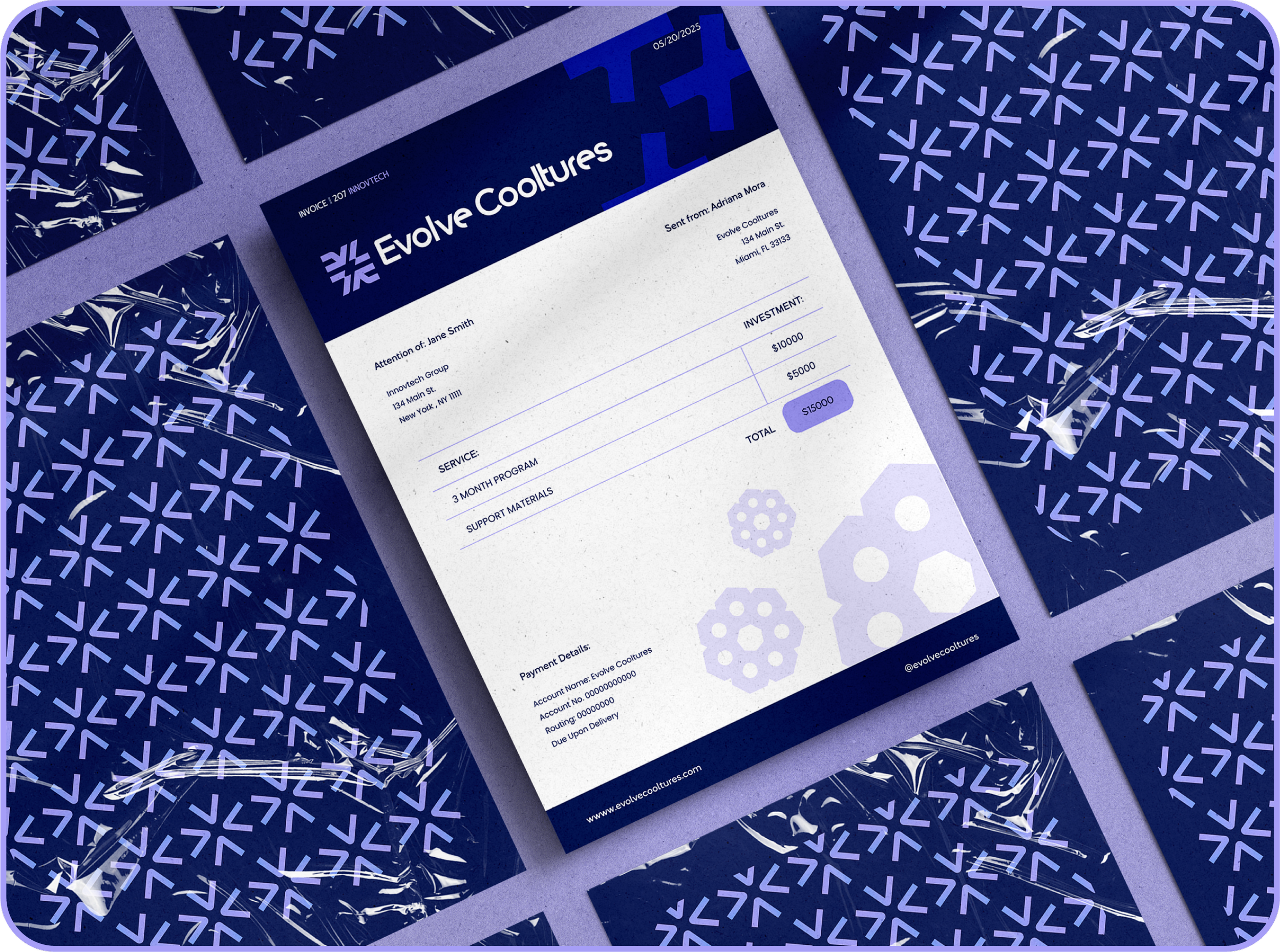
Logo Systems, Icons, Brand Patterns, Color Palette, Typography, Photography Art Direction, Brand Guidelines, Digital & Print Collateral

The Challenge?
Modern companies struggle with agility, talent retention, & sustainable innovation. Evolve Cooltures needed a brand identity that reflected their unique neuroscience-based approach to leadership & team development, all while feeling approachable, credible, & inspiring.

Potential Meets Science
The logo combines the precision of science with the complexity & fluidity of the human experience. These elements represent the mission of empowering human potential, creating thriving & sustainable corporate ecosystems.


-
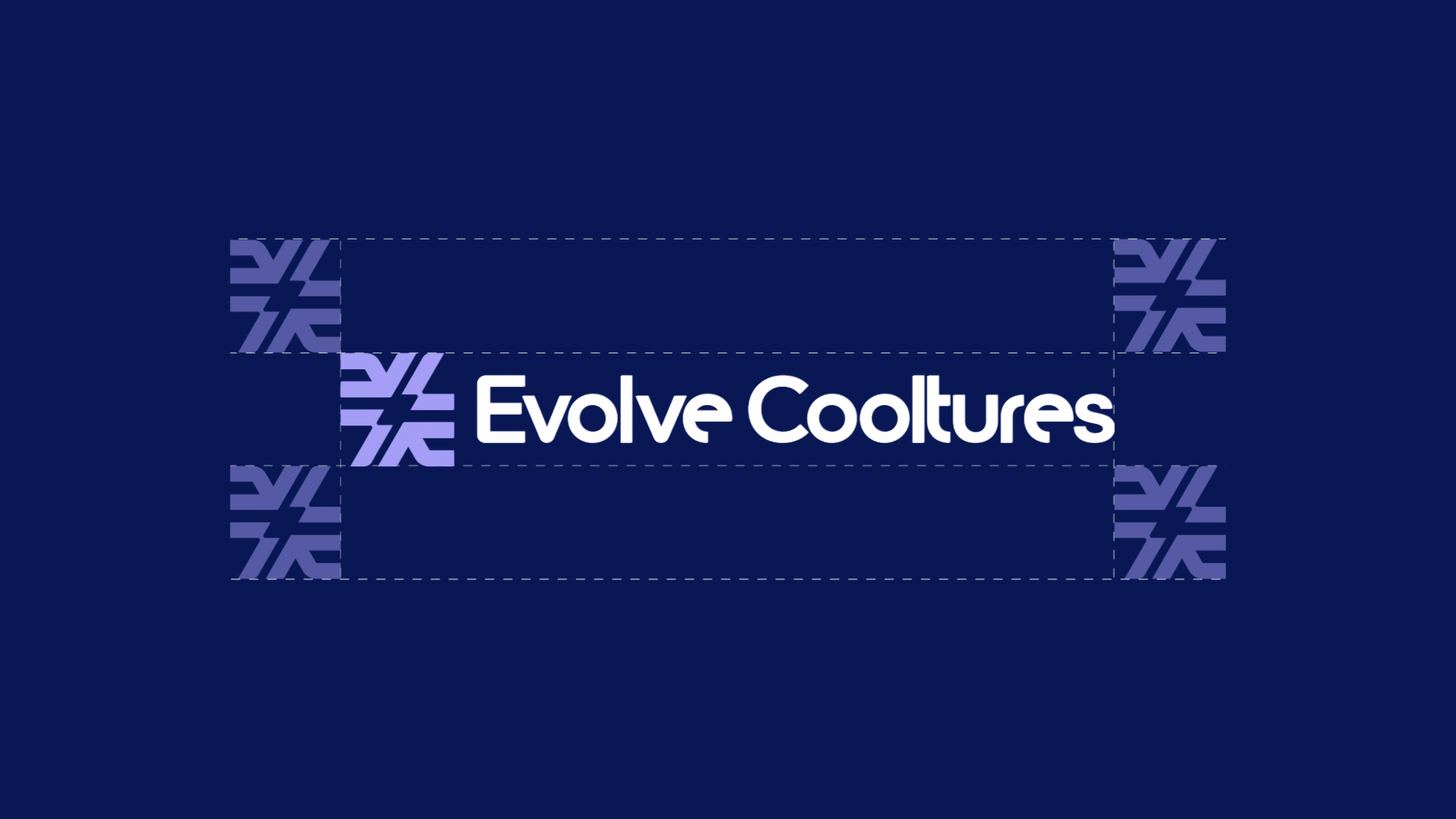
The primary logo Icon combines the letters "E" and "C" with the number 7 and directional arrows, subtly forming a representation of a neuron. This symbol reflects the brand's foundation in neuroscience, integral growth, and continuous feedback. The design combines geometric precision with organic flow, representing both structure and humanity, and aligns with Evolve Cultures' mission to help build and nurture thriving, feedback-driven corporate ecosystems.

-
The logotype has been customized to reflect both the precision of science and the organic nature of human development. Rounded and sharp corners create contrast, while circular vowels reinforce the brand's values of balance, clarity, and purpose.

Color Palette
The brand palette evokes trust, innovation, and well-being. Deep navy conveys knowledge, lavender suggests creativity, and bright blue injects optimism. A clean white base ensures balance and contrast. The gradient applications symbolize transformation, from knowledge to application, from thought to impact.

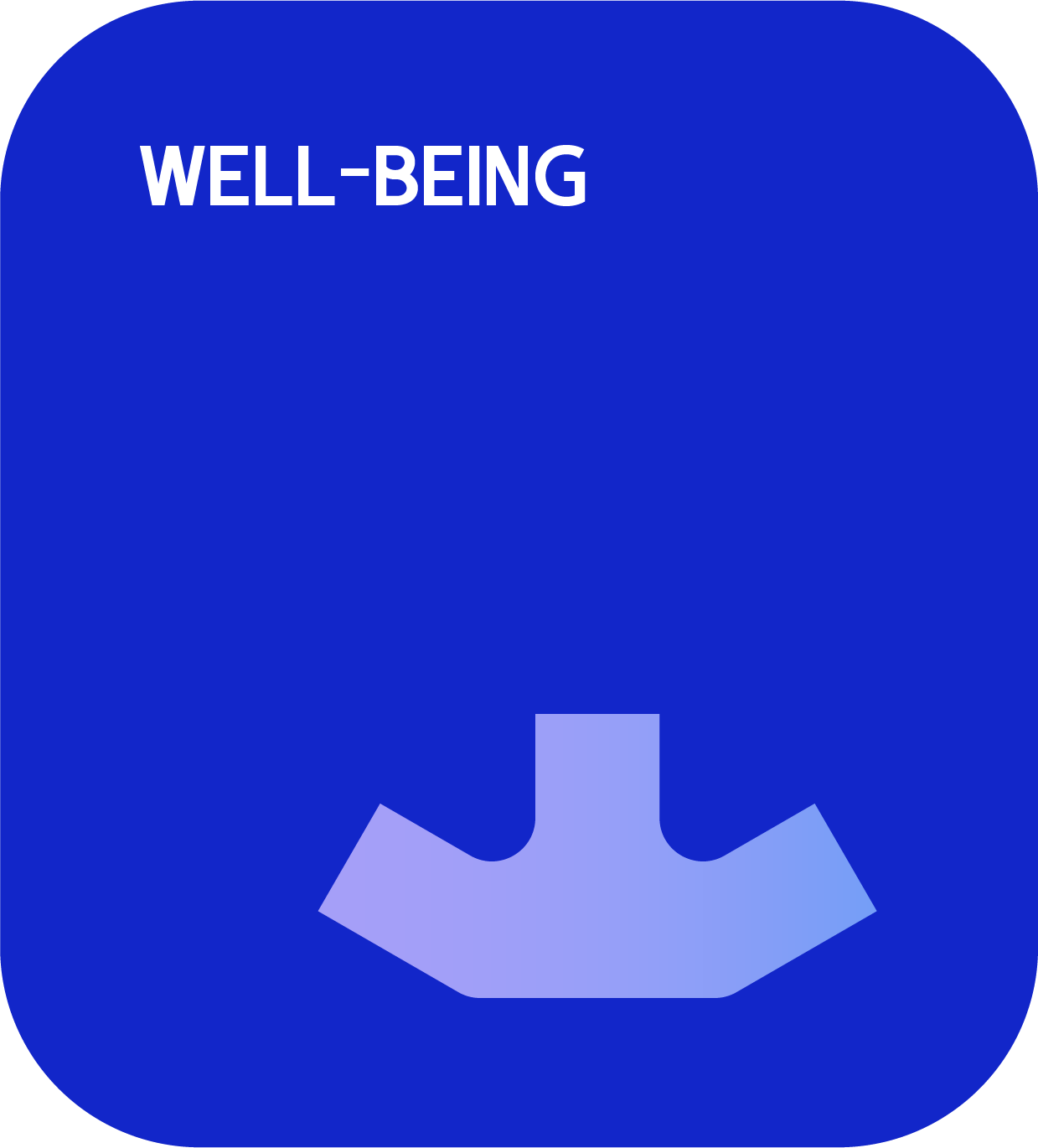

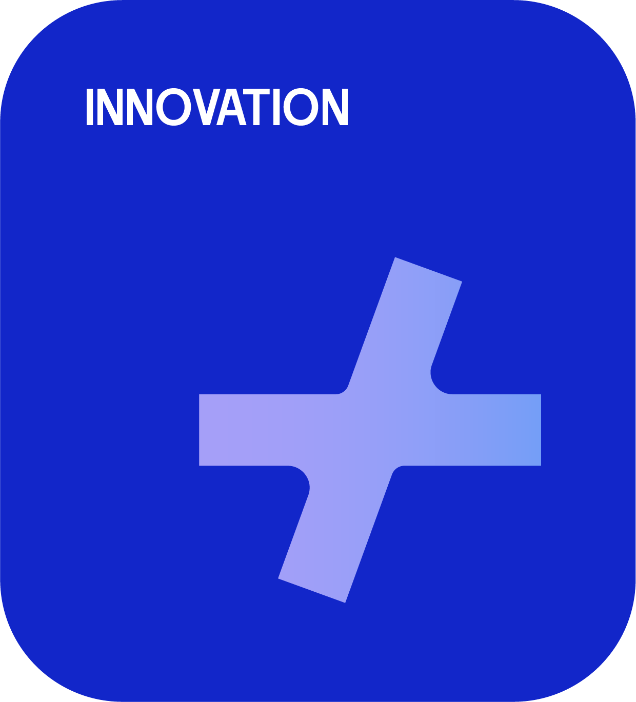
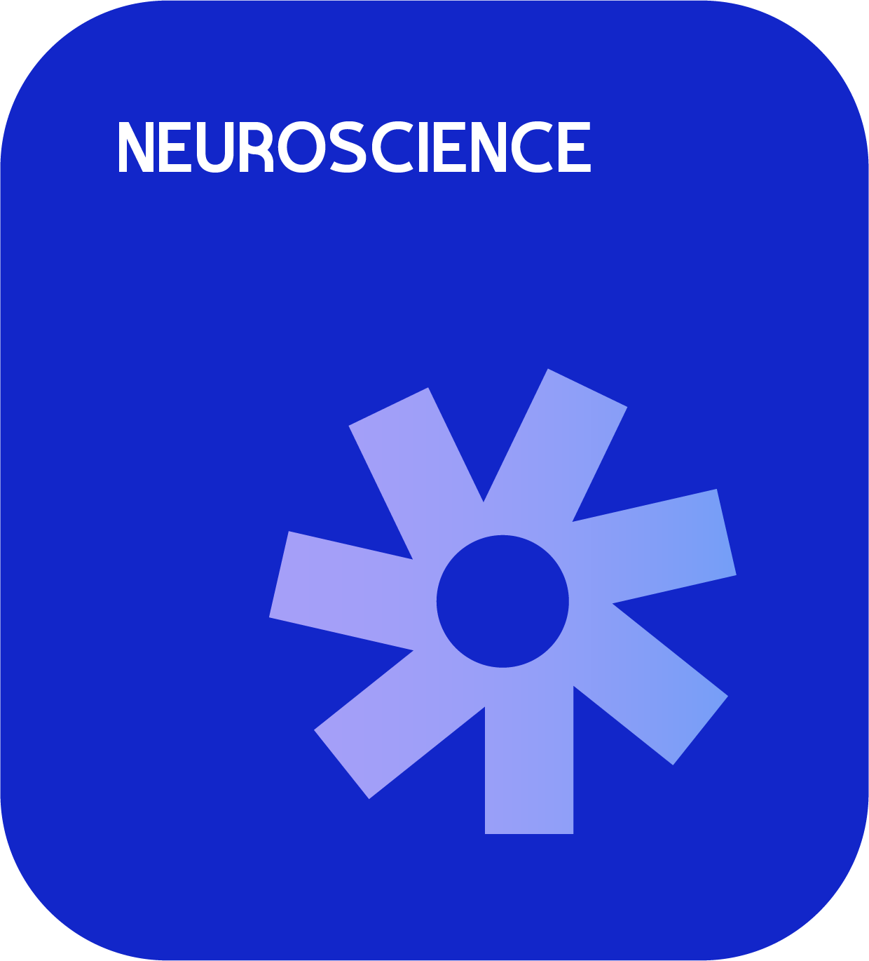
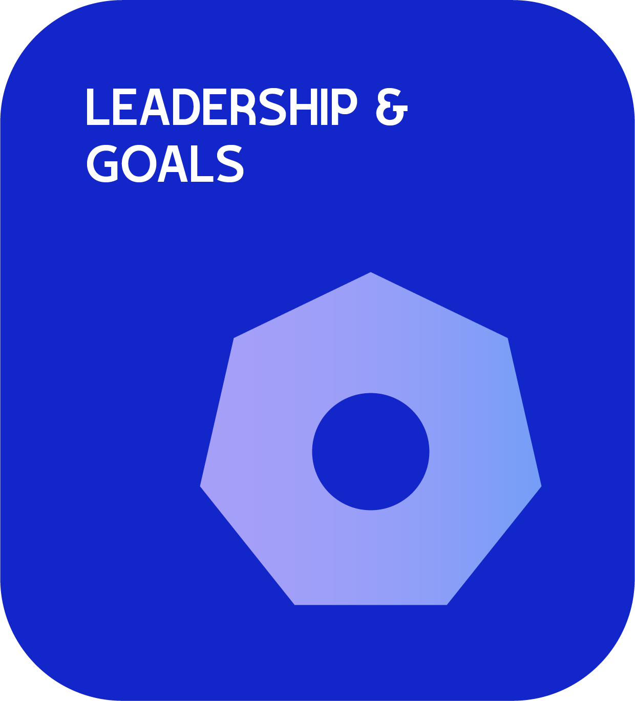
Icons
Each icon is carefully designed to embody the brand's core values and serves as visual cues for practical applications within the program.


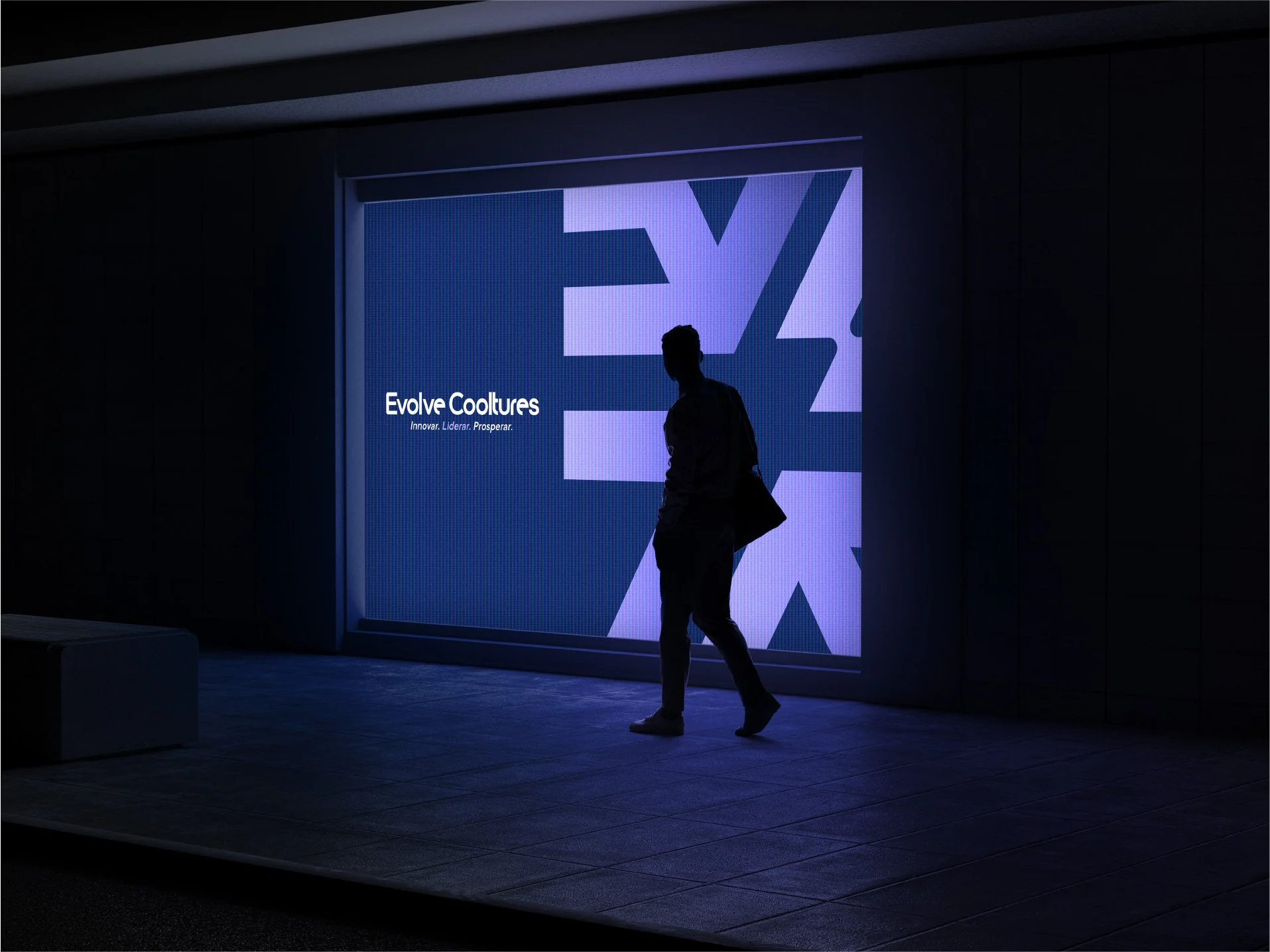
Brand in Action
The art direction for photography focuses on capturing everyday moments with warmth and intention. It features a cohesive tone marked by warm lighting, soft shadows, & brand-color accents. The visuals should highlight real people, success stories, company environments, & behind-the-scenes glimpses to foster connection & authenticity.